People have been here.
People we don't even know.
We are tickled. Well, I am. Anna Falconer is at school, the one class she doesn't take online, and while she knows that the returning party of today's postcard Googled the project and found us, she doesn't know that someone else was here in January, and left a comment! (Why did I assume that I would get some kind of email notice when someone commented? There's probably a setting I need to turn on for that...)
Now that I know that two actual strangers have read at least bits of this blog, I have to apologize. I am old. I began typing on a Royal upright (Anna has an identical typewriter in her room, a gift to her from her dad and me some Christmases ago.) I took typing--typing, not keyboarding--as a high school sophomore, at the same age Anna is now. I learned touch typing, and I am very fast. So yes...except for a few times in this very paragraph which has my attention hyperfocused on it, I follow an old rule that came before computers. It was a rule used only in typing, where not only was the type monospaced (each letter taking up the same space regardless of the letter's width), but the space bar produced a space of consistent width. This meant that there could be some wide spacing within a word (such as between an i and an l, both very narrow letters--a word like "still" would have a lot of white space in it). So two spaces after a period (making one longer space) helped the readability of sentences laid down in monotype.
Printers, meanwhile, used both monospaced and proportional typestyles, and had spaces of varying widths with which to work. They had many more options for spacing, even when working with monospaced typestyles, including putting thin spaces between letters within a word, or putting a thick space at the end of a sentence. Their type was adjustable and their projects usually done in multiples, so they could print one page and make adjustments before rolling off the next 3000. They set up a LOT of printed work, and so got a feel for which kind of spacing would be needed where. And proportional type never needed special spacing at the end of a sentence. One common space, just one, after a period. That was the standard--and a professional knew when to deviate from that standard for readability, and exactly how.
Typewriters, though! A person with absolutely no experience in typestyles would sit down at that machine and type off their final draft in one go. In monotype. With only one space width available.A typed page didn't have the finesse of a printed page. It was course, graceless, and could be hard to read. It became the convention and the standard, with typewriters, to wrap up a sentence with punctuation and two spaces.
Then came the word processor, and very quickly those printing-industry outsiders, regular unskilled people, could use proportional type and varied spacing. It makes sense that the rule codified by typesetters would migrate to computer-based word processing, because they had the same options.
Unfortunately, there was an entire generation or two who got caught between. The two-space rule had been drilled into us. The one-space rule was something we had never heard of (not being insiders of the printing industry). And very often, no one explained to us WHY the two-space rule made no sense in computer word processing, or publishing, or blogging.
I do know. I know that my double spaces can sometimes make for a ragged looking left edge. I know that they drive some of the Born Digital generations a little buggy. But at my age, making the switch is hard. Really hard. I've been touch-typing by the same rules since before some of you were alive. It's a very, very ingrained habit. And I'm at an age where the changing of habits doesn't come easy.
So thank you for being compassionate and tolerant and forgiving me my double spaces.
Tuesday, April 5, 2016

Monday, April 4, 2016
Postcard Feature: Bird with Mohawk
The little boys at our house are six years old, seven next month. They get very excited to help with the Postcards. At six, they're the same age Anna was when this project began, though their artistic sensibilities differ from hers by a large margin.
This postcard is Jonno's work. A bird and tree--not such different subject matter as some of Anna's first cards. But Anna's birds never had such angry faces or such aggressive postures (nor, for that matter, do Jesse's). And the mohawk? Well, that's unique to Jonno, too.
This postcard was "lost" in the Spokane, Washington library in January of this year. It returned to us this week.


This postcard is Jonno's work. A bird and tree--not such different subject matter as some of Anna's first cards. But Anna's birds never had such angry faces or such aggressive postures (nor, for that matter, do Jesse's). And the mohawk? Well, that's unique to Jonno, too.
This postcard was "lost" in the Spokane, Washington library in January of this year. It returned to us this week.


Dear Bailey, thank you for sending our little bird back to us! I cannot quite read your age, but you might be interested to know that the creator of this postcard was six years old at the time he made it.
Tuesday, February 16, 2016
Postcard feature: Slubberdegullion
SLUBBERDEGULLION.
Isn't that just the juiciest word ever? I'll let you look it up. You may find that someone you know comes quickly to mind. Or maybe not, if you're so lucky as to have no slubberdegullions in your life.
I started a series of cards I think of as my vocabulary lessons. I love doing the big letters which calligraphers call initiums and printers call drop caps. And I love finding obscure, delicious, wonderful, nearly-forgotten words to resurrect from their dusty graves.
Isn't that just the juiciest word ever? I'll let you look it up. You may find that someone you know comes quickly to mind. Or maybe not, if you're so lucky as to have no slubberdegullions in your life.
I started a series of cards I think of as my vocabulary lessons. I love doing the big letters which calligraphers call initiums and printers call drop caps. And I love finding obscure, delicious, wonderful, nearly-forgotten words to resurrect from their dusty graves.


Dear Haylie, 8 yrs: Oh, I do believe you can. I have very strong thoughts about heaven.
Thank you for sending this card back to us. I wish you every beautiful thing, including long rides horseback with your Mom through the most beautiful heavenly landscapes. But not too soon. Because earth life is wonderful too, and there is so much to learn.
Monday, December 21, 2015
Postcard feature: Dolphin and basilisk
It's been a bit of a dry spell, but today we got one of Jonno's postcards back from Denver. He calls this one "Dolphin and Basilisk." I'm not sure he actually knows what a basilisk is!


Wednesday, October 21, 2015
Library Feature: Uinta County, Evanston, Wyoming
The Uinta County Library used to be a supermarket, which is easier to believe when you're just reading it as words on a blog than when you are standing in the library looking at its beautiful wood paneling and high arching ceilings. Someone did a great job of turning an old Safeway into an elegant space for books. But as beautiful as it is, and as much as I love books, what really got under my skin about this library were the pianos.
Two pianos.
This library has two pianos.
How cool is that?
The older of the two is a beautiful little upright with an ornate stool. Its unassuming presence belies a wonderful backstory. In the early 1900s, Dale Carnegie donated money to build a library in Evanston. His wife, Louise, donated the piano as her part of the endowment toward a library in Evanston. The library long since moved out of its original building, but Mrs. Carnegie's piano with its pretty stool is still very much a part of the library.


Two pianos.
This library has two pianos.
How cool is that?
The older of the two is a beautiful little upright with an ornate stool. Its unassuming presence belies a wonderful backstory. In the early 1900s, Dale Carnegie donated money to build a library in Evanston. His wife, Louise, donated the piano as her part of the endowment toward a library in Evanston. The library long since moved out of its original building, but Mrs. Carnegie's piano with its pretty stool is still very much a part of the library.


The other piano is a white baby grand. It's beautiful! It was donated to the library in honor of a longtime patron who passed away of cancer in 2005. A picture of the family who donated it now rests on the piano. Sometimes, someone settles on the bench and plays music for the patrons.
I think every library should have a piano!

The Uinta County Library also has some wonderful historical documents and artifacts, and a room filled with Wyoming history. Some other lovely things to look at:


I think every library should have a piano!

The Uinta County Library also has some wonderful historical documents and artifacts, and a room filled with Wyoming history. Some other lovely things to look at:


The pretty arched ceilings.

Postcard feature: Birds on a wire
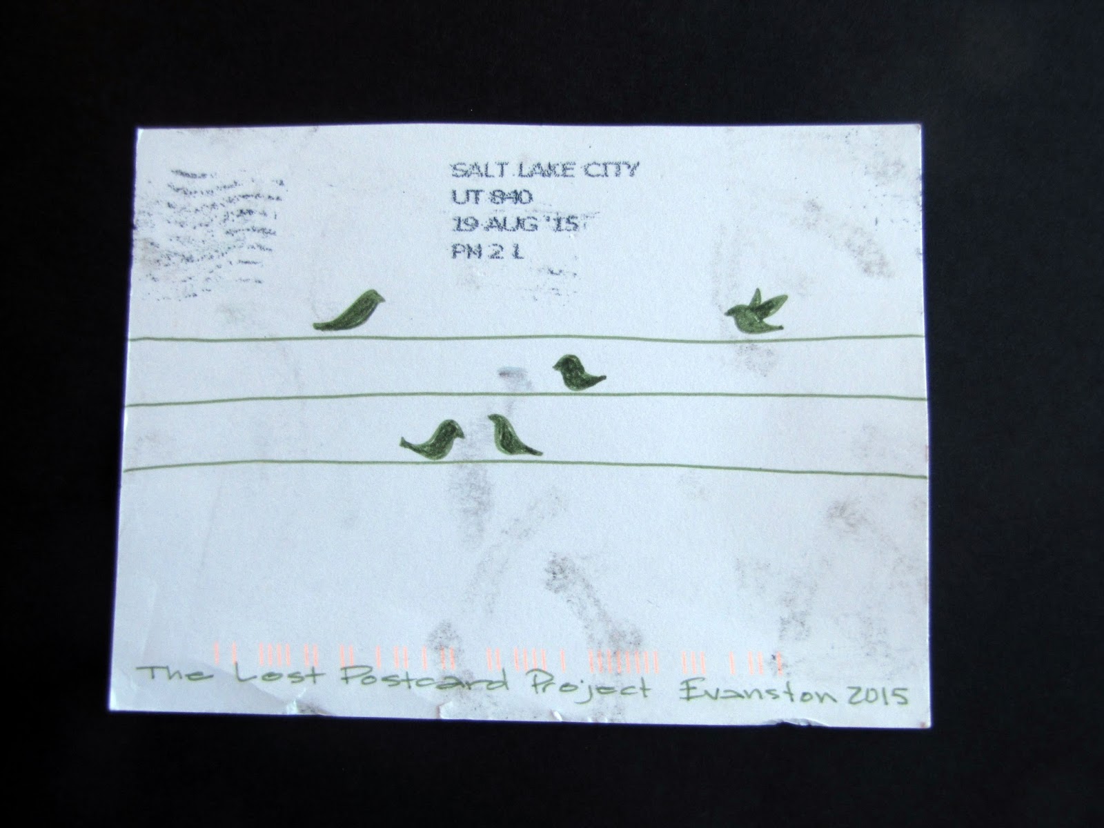
Sometimes, after making lots of postcards, I find myself becoming too entangled in complex ideas and designs, and I have to return to simplicity. It is, after all, just a 4x6 rectangle of paper I'm working with. My tools are limited, too--a few markers, colored pencils, my travel watercolors.
And the card itself may never be found, or may be thrown away, or may be--as this one appears to have been--run over by a truck!
The Uinta County Library is unlike any other. I'll be featuring it in a future post. In the meantime, check out their Facebook page--you can even see this card there in a post from August 6, 2015 when it was discovered in a book about dinosaurs!
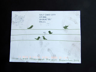

And the card itself may never be found, or may be thrown away, or may be--as this one appears to have been--run over by a truck!
The Uinta County Library is unlike any other. I'll be featuring it in a future post. In the meantime, check out their Facebook page--you can even see this card there in a post from August 6, 2015 when it was discovered in a book about dinosaurs!

Thursday, October 8, 2015
Postcard feature: LOVE
Some people sent our postcards back with long notes...and some don't. This postcard, left in the library in Helena Montana on the same trip as the previous one ("Salt and Pepper"), was returned with just one word--LOVE.
I loved it. It was written in a tightly doodled hand ("hand" is what we calligraphers call fonts; to me, a font is something mechanically produced). The doodling that defined the letterforms was more than just scribbling--I was pretty sure I could see letterforms in the tangled lines. "Girls" appears quite clearly, for example, in the top extension of the E. But while the rest of it had the appearance of deliberate, meaningful movement, I couldn't discern any other words.
The postcard itself was inspired by a pattern in the carpet of the hotel.
I loved it. It was written in a tightly doodled hand ("hand" is what we calligraphers call fonts; to me, a font is something mechanically produced). The doodling that defined the letterforms was more than just scribbling--I was pretty sure I could see letterforms in the tangled lines. "Girls" appears quite clearly, for example, in the top extension of the E. But while the rest of it had the appearance of deliberate, meaningful movement, I couldn't discern any other words.
The postcard itself was inspired by a pattern in the carpet of the hotel.


Subscribe to:
Posts (Atom)