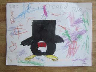
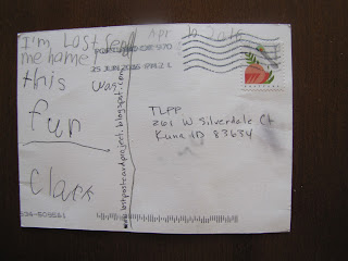
People have been here.
People we don't even know.
We are tickled. Well, I am. Anna Falconer is at school, the one class she doesn't take online, and while she knows that the returning party of today's postcard Googled the project and found us, she doesn't know that someone else was here in January, and left a comment! (Why did I assume that I would get some kind of email notice when someone commented? There's probably a setting I need to turn on for that...)
Now that I know that two actual strangers have read at least bits of this blog, I have to apologize. I am old. I began typing on a Royal upright (Anna has an identical typewriter in her room, a gift to her from her dad and me some Christmases ago.) I took typing--typing, not keyboarding--as a high school sophomore, at the same age Anna is now. I learned touch typing, and I am very fast. So yes...except for a few times in this very paragraph which has my attention hyperfocused on it, I follow an old rule that came before computers. It was a rule used only in typing, where not only was the type monospaced (each letter taking up the same space regardless of the letter's width), but the space bar produced a space of consistent width. This meant that there could be some wide spacing within a word (such as between an i and an l, both very narrow letters--a word like "still" would have a lot of white space in it). So two spaces after a period (making one longer space) helped the readability of sentences laid down in monotype.
Printers, meanwhile, used both monospaced and proportional typestyles, and had spaces of varying widths with which to work. They had many more options for spacing, even when working with monospaced typestyles, including putting thin spaces between letters within a word, or putting a thick space at the end of a sentence. Their type was adjustable and their projects usually done in multiples, so they could print one page and make adjustments before rolling off the next 3000. They set up a LOT of printed work, and so got a feel for which kind of spacing would be needed where. And proportional type never needed special spacing at the end of a sentence. One common space, just one, after a period. That was the standard--and a professional knew when to deviate from that standard for readability, and exactly how.
Typewriters, though! A person with absolutely no experience in typestyles would sit down at that machine and type off their final draft in one go. In monotype. With only one space width available.A typed page didn't have the finesse of a printed page. It was course, graceless, and could be hard to read. It became the convention and the standard, with typewriters, to wrap up a sentence with punctuation and two spaces.
Then came the word processor, and very quickly those printing-industry outsiders, regular unskilled people, could use proportional type and varied spacing. It makes sense that the rule codified by typesetters would migrate to computer-based word processing, because they had the same options.
Unfortunately, there was an entire generation or two who got caught between. The two-space rule had been drilled into us. The one-space rule was something we had never heard of (not being insiders of the printing industry). And very often, no one explained to us WHY the two-space rule made no sense in computer word processing, or publishing, or blogging.
I do know. I know that my double spaces can sometimes make for a ragged looking left edge. I know that they drive some of the Born Digital generations a little buggy. But at my age, making the switch is hard. Really hard. I've been touch-typing by the same rules since before some of you were alive. It's a very, very ingrained habit. And I'm at an age where the changing of habits doesn't come easy.
So thank you for being compassionate and tolerant and forgiving me my double spaces.


